
Transport NSW — SCATS Traffic System
Translating policy-heavy transport operations into scalable, usable workflows
Overview
SCATS is a legacy desktop-based traffic control system used to monitor and manage live intersection performance. The goal of this project was to modernise the interface into a web-based application, improving usability, accessibility, and operational clarity while respecting strict architectural constraints.
I led the redesign of site investigation workflows, focusing on map-based context, note management, and operational visibility.
Context
SCATS (Sydney Coordinated Adaptive Traffic System) supports traffic management operations and service workflows.
The platform involved:
Data-heavy operational dashboards
Policy-driven processes
Multi-role user access (operators, analysts, administrators)
Strict governance and regulatory constraints
Users needed to interpret complex operational data and execute time-sensitive decisions within defined compliance frameworks.
However, the existing workflows were:
Fragmented across modules
Dense with policy and operational detail
Inconsistent in interaction patterns
Difficult for new users to onboard into
My Role
Senior Product Designer (Accenture delivery team):
Led workflow mapping and service blueprint creation
Conducted stakeholder workshops and co-design sessions
Translated policy and operational requirements into structured interaction patterns
Built reusable Figma design systems for consistency
Partnered closely with product managers, BAs, and engineers
Outcome
By introducing structured UX artefacts and clearer workflow models, I reduced cross-team ambiguity between design, BA, and engineering functions. This enabled faster refinement sessions, fewer clarification cycles, and more predictable delivery outcomes in a high-complexity environment. The work also improved stakeholder alignment and provided a scalable interaction framework that supported future enterprise enhancements.
New web based application
Current application

Current Application (Legacy Desktop SCATS)
The existing SCATS Access system is a desktop-based application with dense data panels, legacy visual patterns, and limited spatial context integration.
Information is distributed across multiple tabs and widgets, requiring high system familiarity to interpret operational status. While powerful, the interface relies heavily on institutional knowledge and presents a steep learning curve for new users.
Navigation and data visibility are fragmented, increasing cognitive load during time-sensitive investigations.

New Web-Based SCATS Application
The redesigned web-based SCATS Access application modernises the experience by integrating operational data directly alongside an interactive map.
Key improvements include:
Contextual information panels that preserve map visibility
Clear hierarchy of site status, alarms, and performance data
Simplified navigation with progressive disclosure
Improved readability and spatial awareness
The new design reduces cognitive load, supports faster investigation workflows, and makes critical site information easier to interpret in real time.
The Problem
The core issue was not missing functionality — it was structural complexity.
Users struggled with:
Navigating between operational views
Interpreting dense policy language in workflow steps
Understanding task ownership and sequence
Managing data-heavy interfaces with limited hierarchy
Operational teams often relied on internal knowledge or manual clarification rather than trusting the interface.
This created friction and slowed service processes.
Research Approach & Constraints
Research & Stakeholder Alignment
Due to the nature of the SCATS project, direct access to end users was limited — operators and planners were embedded in live operations, and observational sessions were constrained by traffic management priorities. In the absence of traditional user interview access, I adapted by:
Working closely with proxy users (business analysts, support staff, and power users) who regularly interacted with the system and could articulate workflow breakdowns and pain points.
Synthesising insights from existing support logs, workshop recordings, and historical project artefacts to identify recurring friction points and ambiguity in task flows.
Framing assumptions early and validating them internally with engineers and BAs to reduce risk, refine interaction models, and align on priority areas for design focus.
This adaptive strategy enabled me to extract meaningful user insights despite research constraints, anchor design decisions in observable user behaviour patterns, and maintain momentum in refining workflows and UI patterns.
User Persona Caption (SCATS)
User Persona — Traffic Operations Officer
To ground the redesign in real operational context, I developed primary personas representing traffic operations and service teams.
The primary persona — a Traffic Operations Officer — was responsible for monitoring live data, responding to incidents, and coordinating across departments under time pressure.
Key characteristics:
High-stakes, time-sensitive decisions
Dependent on accurate, structured data
Working within strict policy and compliance frameworks
Low tolerance for ambiguous workflows
This persona helped anchor design decisions around clarity, speed, and error prevention in regulated environments.

Journey mapping - Operational Workflow Analysis
I mapped the end-to-end service workflow from incident identification to resolution, identifying friction points across:
Data interpretation
Task ownership
Policy validation steps
Cross-team handoffs
The journey map revealed:
Redundant navigation between modules
Policy instructions embedded inside action screens
Lack of clear progression indicators
Unclear accountability during escalation
These insights informed the restructuring of task flows and the separation of policy guidance from actionable UI components.

Problem Definition Workshop
With limited customer access, I facilitated a cross-functional workshop with 9 representatives from Product, Design, and Engineering to surface assumptions and define the real problem space.
Goal:
Move from feature requests to validated problem statements.
Activities included:
Knowledge sharing session to align on current system behavior
Assumption mapping to uncover hidden constraints
Categorising site notes, messages, and system messages
Defining in-scope vs out-of-scope boundaries
Key outcomes:
Clarified ownership and lifecycle differences between message types
Identified redundancy between site notes and system messages
Defined MVP scope (create, edit, delete)
Parked complex areas (permissions, migration, search) for future phases
This workshop prevented over-engineering and helped the team align on a realistic first release.


Ideation & Rapid Exploration
Following alignment, I translated workshop insights into rapid sketch explorations.
The goal was to:
Explore multiple layout options
Test interaction models for message creation and editing
Balance system-wide visibility with contextual relevance
Validate feasibility with Engineering early
Over several iterations, concepts evolved from broad structural changes to lighter, incremental improvements that respected existing architecture.
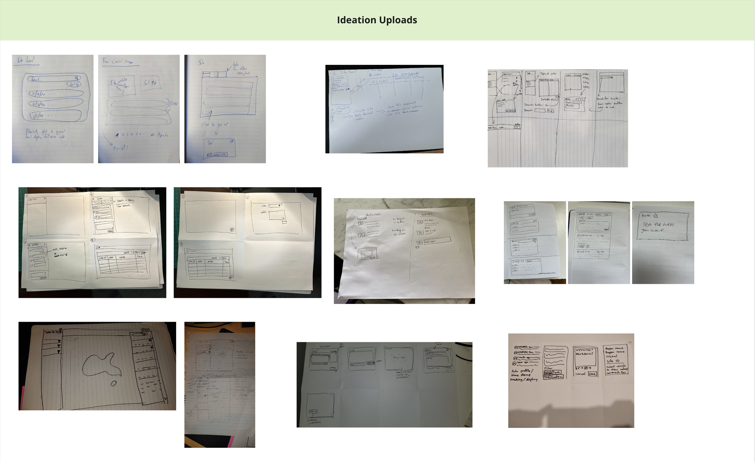

Concept Exploration

Design A — Dedicated Pop-up Panel
This concept introduced a focused pop-up panel for creating and viewing notes without leaving the map context.
Strengths
Provides more visual space for content, improving readability.
Allows larger icons and typography — better suited for eligibility and status visibility.
Enables users to review multiple items without navigating back and forth.
Reduces cognitive switching between map and content views.
Trade-offs
Requires additional UI layer and engineering effort.
Introduces another interaction state to manage.
Potential complexity in maintaining consistency with existing panel patterns.
This option prioritised usability and clarity but required additional development investment.

Integrated Info Panel (All-in-One)
This concept reused the existing information panel to manage notes and messages within a single structured layout.
Strengths
Keeps all interactions within the existing system pattern.
Minimises development effort by leveraging current components.
Maintains interface consistency.
Trade-offs
Limited space reduces readability.
Smaller icons and typography impact scanability.
Requires more back-and-forth navigation to review content.
Less suitable for content-heavy workflows.
This option was technically efficient but introduced usability compromises under high-volume scenarios.

Slack-Style Inline Composer
Inspired by chat-based interaction patterns, this concept allowed users to type and post notes directly within the map interface.
Strengths
Encourages fast note entry.
Familiar interaction model for users.
Lightweight and flexible for quick updates.
Trade-offs
Disconnected from structured note management.
More complex to implement within the existing architecture.
Risk of increasing information noise without hierarchy controls.
May not align with enterprise governance requirements.
This concept optimised speed but raised concerns around structure, scalability, and technical feasibility.
Decision Rationale
After evaluating usability impact, development effort, and system constraints, we prioritised a solution that balanced readability improvements with architectural feasibility.
Rather than pursuing a full structural redesign, we adopted a lighter implementation that improved clarity while remaining within delivery timelines.
This demonstrates trade-off management — not just design preference.
UI workflow
Scope of Design & Delivery
The release focused on enabling full lifecycle management of site notes within the map interface.
Core Capabilities
View existing notes
Create new notes
Edit and save updates
Delete notes
System States Considered
Overview visibility while editing
Maximum character limits
Empty states
Loading indicators
Error states (update failure, load failure)
This ensured the experience was robust — not just visually complete.
User Workflow — Editing and Saving Notes

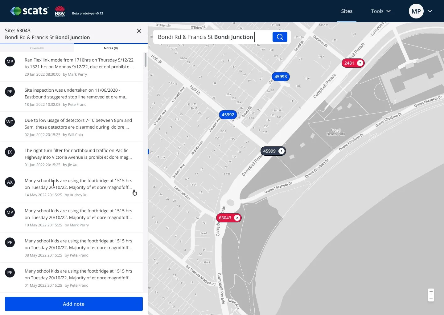
Step 1 — Identify Site
Upon login, users see site markers on the map.
If a site ID (e.g. 63043) is highlighted in red, it signals an alert condition requiring investigation.
Users select the site to view more details.

Step 3 — View Notes
Users navigate to the Notes tab within the panel.
Here they can:
Review existing notes
See timestamps
Identify authors
Scan historical updates

Step 2 — Access Site Overview
The information panel slides in from the left, providing an overview of site status, operational data, and alerts.
This allows users to maintain map context while reviewing details.

Step 4 — Open a Note
Selecting a note expands it within the panel.
Users can:
Read the full content
Edit or delete the note
Maintain visibility of the map while reviewing content

Step 5 — Edit Mode
Clicking Edit transitions the note into an editable state.
The user can:
Modify text
Apply basic formatting
Review changes before saving
Inline controls prevent accidental navigation loss.

Step 6 — Save or Cancel
Users can:
Click Save to persist changes
Click Cancel to discard edits
Validation ensures:
Character limits are respected
Errors are surfaced clearly
Data loss is prevented
Step 7 — Post-Save State
After saving:
The updated timestamp is displayed
The editor’s name is recorded
The panel returns to read-only mode
The note list refreshes automatically
This reinforces system feedback and audit transparency.
Edge Cases & System States
To ensure the experience was production-ready, I designed for key edge cases beyond the happy path.
Covered States
Confirmation before deletion to prevent accidental data loss
Inline error handling when notes fail to save or load
Loading indicators during network delays
Clear empty states when no notes exist
Capacity warning when maximum notes are reached
Designing these states ensured the feature was resilient, predictable, and aligned with operational governance standards.

Error State — Save Failure
If a system or network error occurs while saving, the user is shown a clear inline error message without losing their input.
This prevents accidental data loss and allows the user to retry the action confidently, reinforcing reliability in operational workflows.
Empty State — No Notes Available
When a site has no notes, a clear empty state message is shown with a visible Add note call to action.
This guides users toward the next step and prevents confusion caused by blank or ambiguous interfaces.

Maximum Note Limit — Capacity Reached
When the maximum limit of 10 notes is reached, the system displays a clear warning and disables further additions.
This makes constraints visible upfront, avoids silent failures, and supports governance requirements around information volume control.
Reflection
This project shaped my approach to enterprise UX.
Key learnings:
In regulated environments, clarity must coexist with compliance.
Service design and workflow mapping are critical before UI decisions.
Standardised patterns reduce long-term delivery friction.
Large-scale systems require alignment across policy, operations, and engineering.
SCATS marked my transition from interface design to systems thinking — a foundation that later informed my work on complex SaaS platforms like Capsifi and LandIQ.
Next Case Study

Capsifi — Value Stream Experience
Redesign of the Value Stream feature, a key tool for business architects to visualise customer value flow across capabilities, processes, and units.