
Capsifi — AI Upload Workflow Redesign
Reducing errors and increasing activation through guided validation
Overview
Capsifi’s AI-assisted upload feature had high failure rates and support tickets due to unclear guidance and confusing interaction states. I designed an improved AI upload experience that reduced errors and support burden while increasing user confidence and task completion.
The Problem
The AI-assisted upload workflow was creating friction at a critical moment in the user journey.
Several core issues were contributing to confusion and failure:
The upload flow lacked clear system feedback, leaving users unsure whether their files were processing correctly.
File validation rules were not obvious, causing users to upload incorrect formats or incomplete data.
Error states were reactive rather than preventative, meaning users only discovered problems after submission.
The AI processing state created uncertainty, with limited visibility into what the system was doing or how long it would take.
As a result, users experienced avoidable failures and repeated attempts
Business Impact
This friction had measurable consequences:
Increased support load due to avoidable upload errors.
Slower user activation within the platform.
Reduced trust in the AI-assisted feature, particularly for first-time users.
Because the upload experience sat at a key onboarding and workflow entry point, these issues were not isolated usability problems — they directly affected adoption, confidence, and operational efficiency.
The design challenge was to transform a high-friction, failure-prone workflow into a clear, guided, and trustworthy experience that reduced errors and improved activation outcomes.
My Role
I was the sole UX lead for the AI-assisted upload feature, responsible for shaping the end-to-end experience from discovery through delivery.
I partnered closely with Product and Engineering to define the UX strategy, align on priorities, and ensure solutions were technically feasible and scalable. I worked collaboratively to translate business goals and user pain points into clear design directions.
I conducted usability validation to identify friction points, test hypotheses, and refine interaction patterns before development. Based on these insights, I led the full interaction redesign — simplifying workflows, improving feedback states, and introducing clearer guidance throughout the upload process.
I also contributed updates to the design system to ensure new interaction patterns were reusable, consistent, and aligned with broader platform standards.
Hypothesis & Approach
Hypothesis
We believed the high failure rate was not a technical limitation, but a clarity problem.
If we introduced clearer progressive guidance, real-time validation feedback, and more transparent AI processing states, users would complete uploads successfully on their first attempt. This would reduce friction, lower support demand, and increase confidence in the AI-assisted workflow.
Approach
To validate this, I:
Identified key friction points through usability testing and support ticket analysis.
Mapped the upload journey to isolate where confusion and drop-offs occurred.
Prioritised improvements that addressed clarity before adding new functionality.
Prototyped simplified guidance patterns and inline validation to test with users before development.
Worked closely with engineering to ensure feedback states were technically feasible and scalable.
Rather than redesigning the entire flow at once, we focused on high-impact friction points and iterated based on behavioural feedback and measurable outcomes.

End-to-End Upload Flow Mapping to Identify Failure Points
Before Vs After
Before: Friction and Uncertainty
The original upload experience behaved like a static form rather than a guided workflow.
Users were presented with dense instructions upfront, requiring them to interpret rules before taking action.
Validation occurred only after submission, resulting in reactive error messages.
AI processing lacked transparency, leaving users unsure whether the system was working correctly.
Key actions were visually equal in hierarchy, creating confusion about sequence and dependency.
The experience required users to guess the correct order of steps, increasing cognitive load and failure rates.
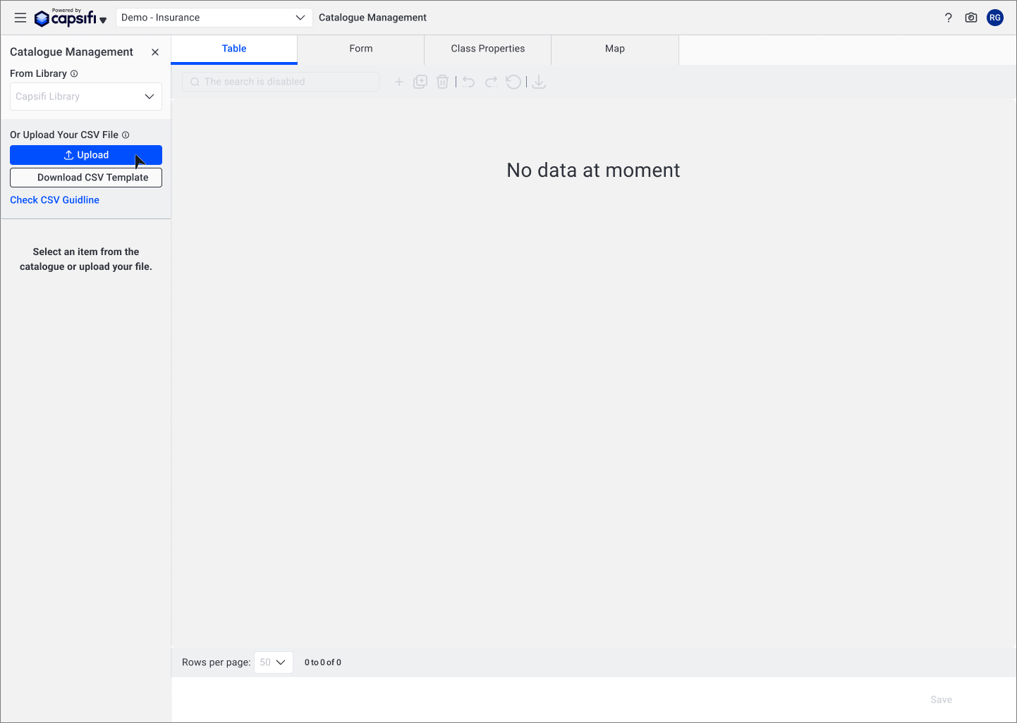
Confusing Action Hierarchy in Upload Entry Point
The upload and library selection controls were placed close together without clear hierarchy, leading users to assume a dependency between them.
The AI action button was also positioned in a way that implied availability at all times, even though it only functioned after selecting a business capability.
This unclear visual hierarchy created hesitation, incorrect sequencing, and unnecessary support queries at the very start of the workflow.
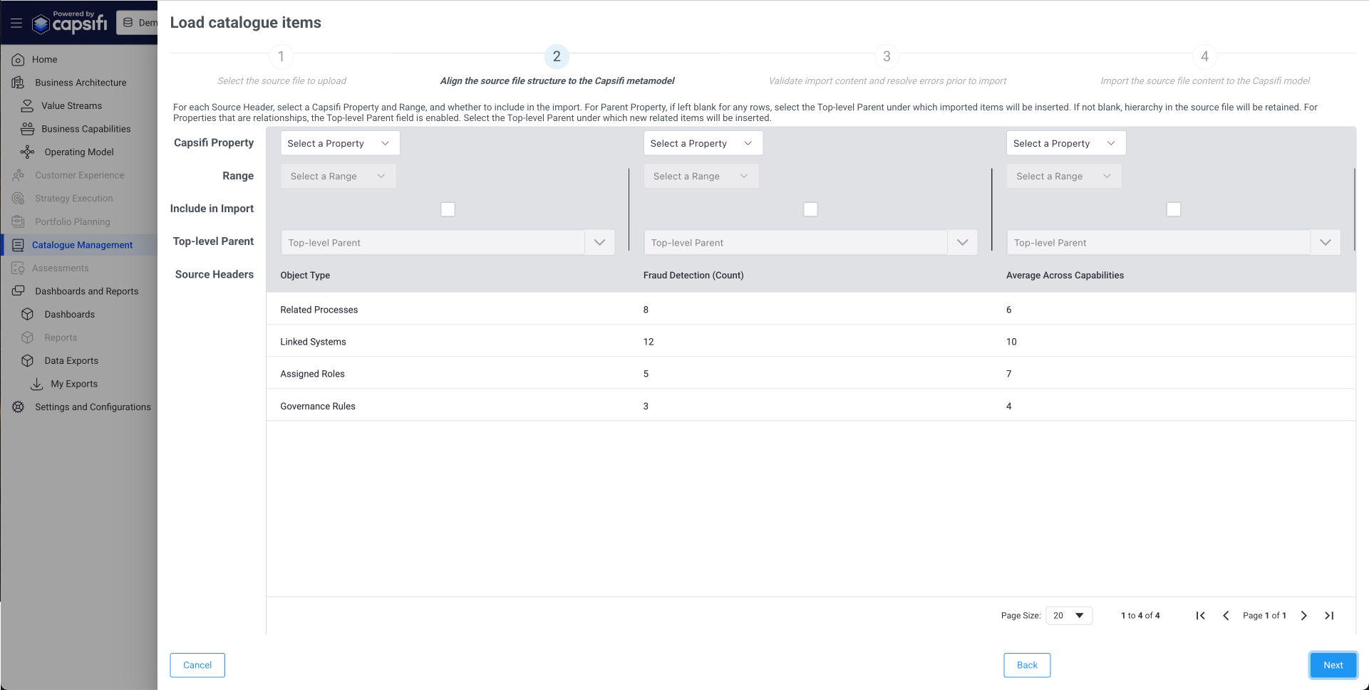
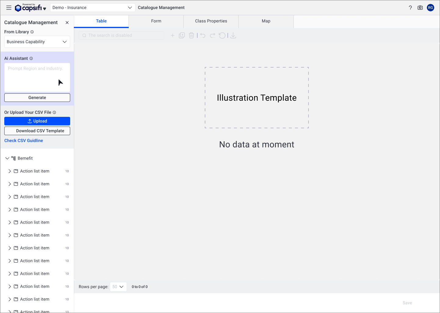
Table Layout Hindering Left-to-Right Data Scanning
The vertical table structure required users to scan down multiple columns before understanding relationships between fields.
Because users typically process tabular data from left to right, this structure increased cognitive load and made mapping properties unclear.
Combined with ambiguous language, this led to confusion and frequent abandonment during the upload process.
After: Guided, Transparent Workflow
The redesigned experience shifted from a static form to a structured, progressive workflow.
Instructions were simplified and embedded contextually at the point of need.
Inline validation provided real-time feedback before submission.
AI processing states were clarified with clear system messaging and status indicators.
Action hierarchy was redesigned to reflect logical sequence and reduce ambiguity.
The result was a more predictable and confidence-building experience that aligned with users’ mental models.
Clarifying Entry Paths to Reduce Upload Errors
The original layout presented Library selection and File Upload as visually competing actions, creating ambiguity about whether they were dependent on each other.
Users often assumed they needed to select from the Library before uploading, even though the actions were independent. The placement of the AI button further increased confusion, implying functionality that was not yet available.
The redesign clearly separated these entry paths, removed premature AI affordances, and surfaced the CSV guide earlier in the flow. This reduced hesitation and prevented avoidable upload errors at the start of the journey.
Introducing Clear System Feedback During Upload
Previously, users lacked visibility into what was happening after initiating an upload. The absence of clear progress feedback created uncertainty and increased abandonment.
The redesigned flow introduced a structured, step-based process with visible progress indicators and inline validation. This made system behaviour more transparent and aligned with user expectations.
By clarifying what the system was doing — and what the user needed to do next — the experience shifted from reactive error handling to guided completion.
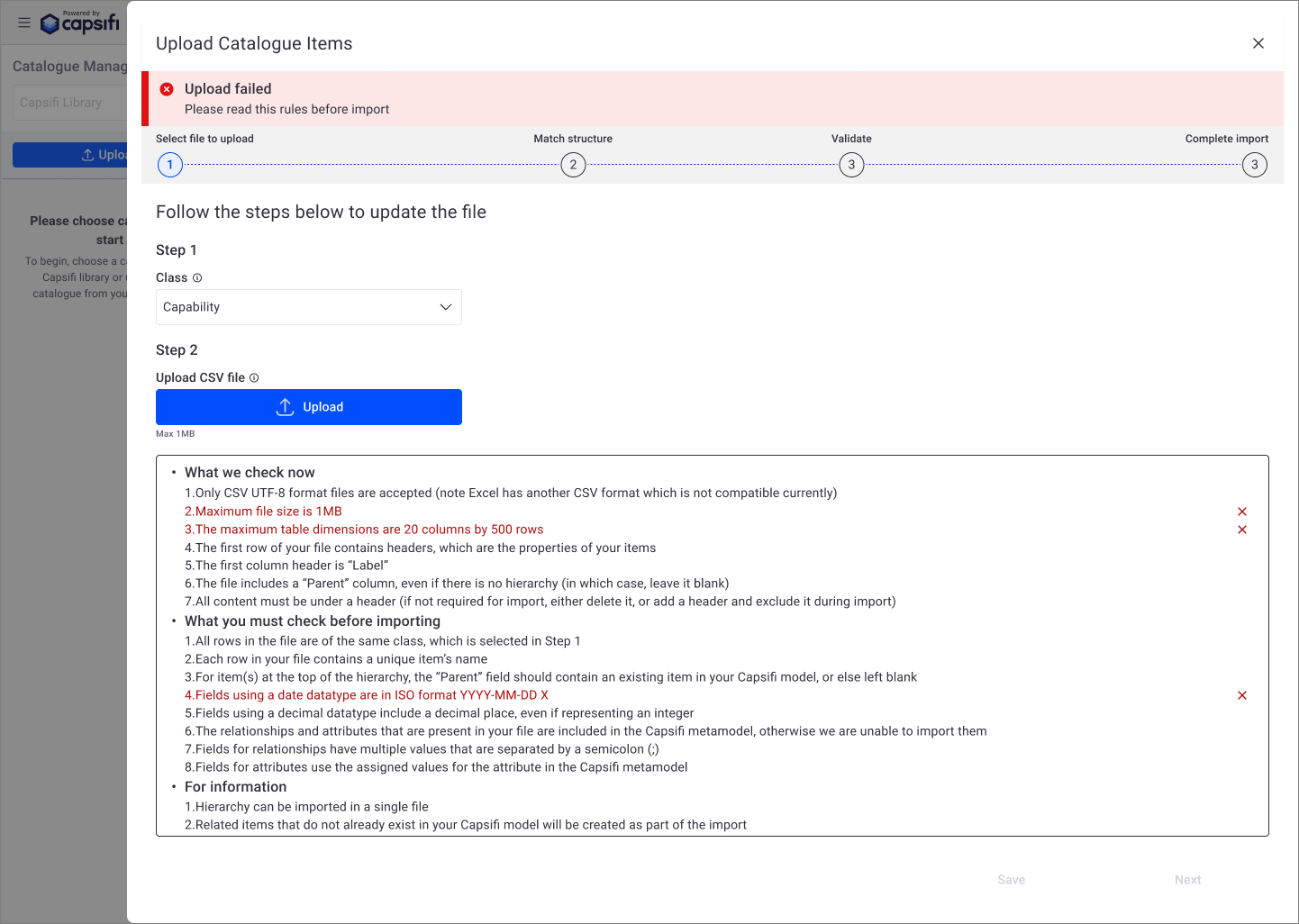
Shifting from Generic Failure to Actionable Validation Feedback
Previously, upload failures were presented as generic error messages without clearly indicating which part of the CSV file was invalid. Users were required to interpret lengthy rule lists and manually identify issues, increasing frustration and repeat failures.
The redesigned experience introduced clearer validation messaging and highlighted the specific fields that did not meet import requirements. This reduced ambiguity and enabled users to correct errors independently, decreasing support dependency and repeated submission attempts.
By making validation feedback specific and actionable, the system shifted from reactive error handling to guided correction.
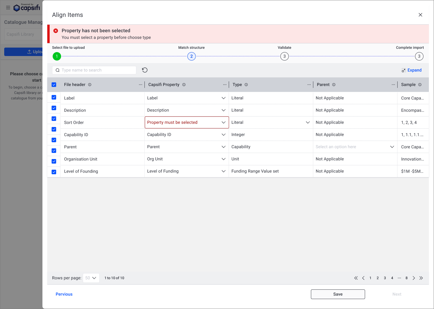
Making Validation Errors Specific and Visible
Previously, validation errors were surfaced at a high level, forcing users to scan the table to identify which field required attention. This increased frustration and slowed progress.
The redesigned experience highlights the exact dropdown cell with the issue and displays a clear, contextual error message. This directs attention precisely where action is needed, reducing ambiguity and preventing unnecessary rework.
By making validation feedback immediate and location-specific, users can resolve issues quickly without leaving the workflow.
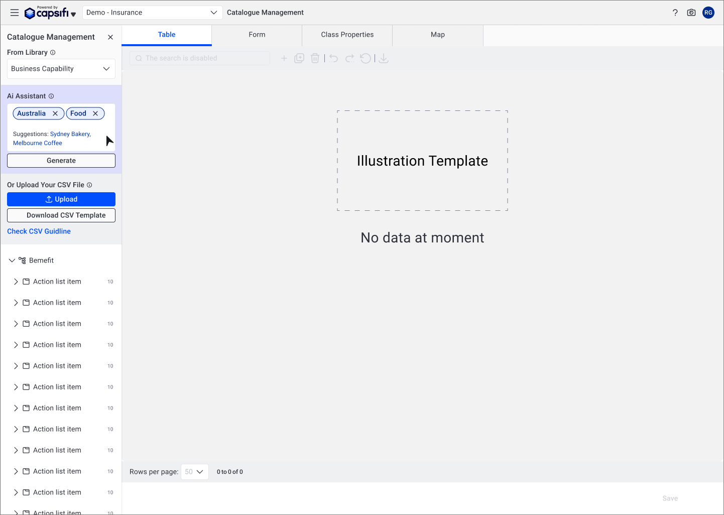
Making AI Context-Aware Instead of Always-On
Previously, the AI assistant was visible regardless of whether a business capability had been selected. This created ambiguity around when the feature could be used and what inputs were required, leading to confusion and premature interaction.
The redesign introduced conditional visibility, ensuring the AI assistant only appears once a business capability is selected. This aligns the feature with user intent and prevents unnecessary cognitive load at the start of the workflow.
By making AI context-aware rather than constantly present, the interface becomes more predictable and reduces misinterpretation of system capabilities..
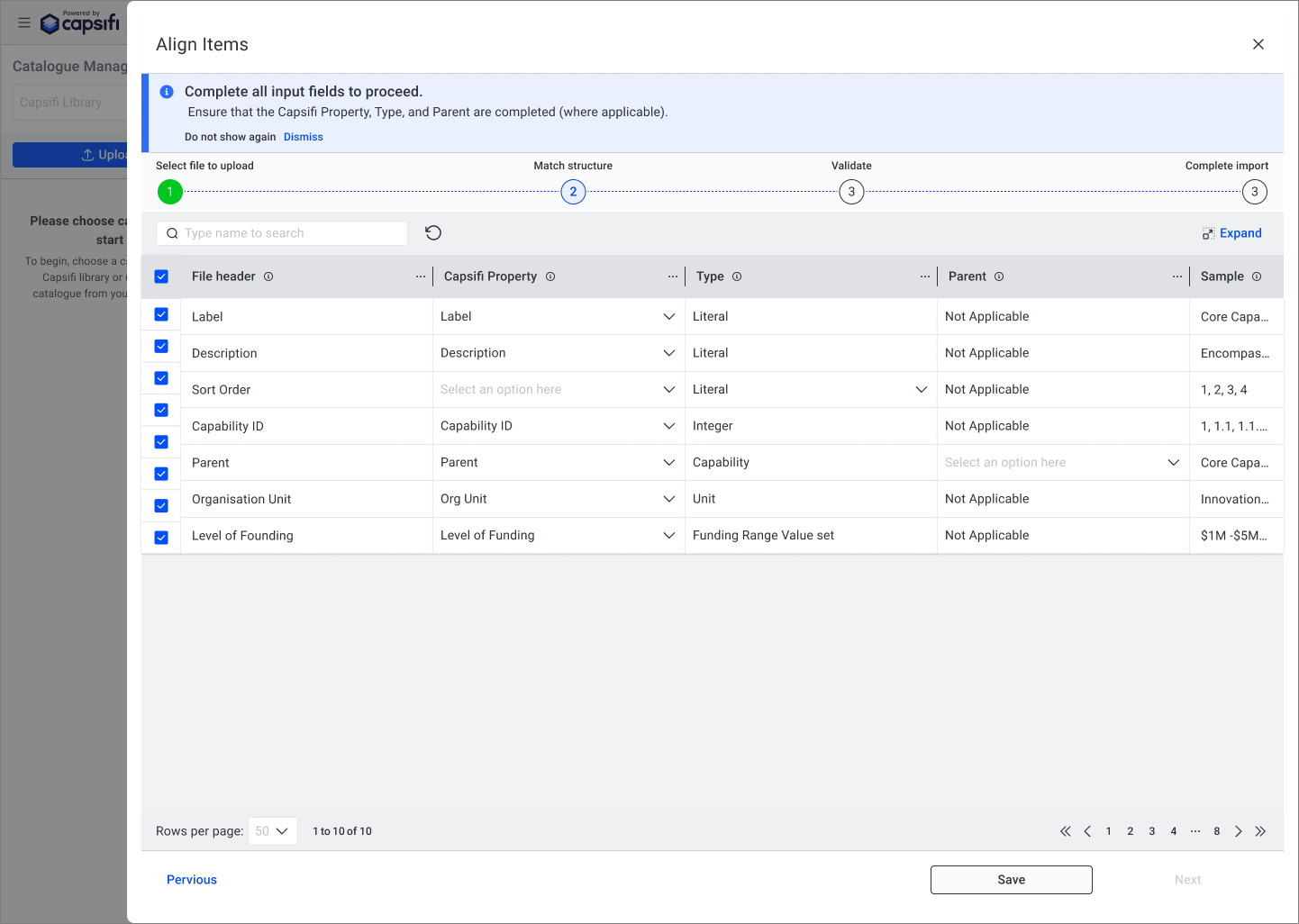
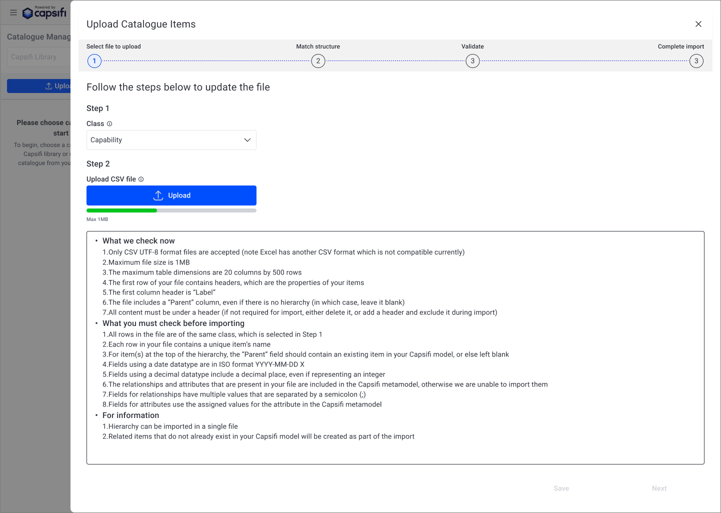
Introducing Structured, Step-Based Import Guidance
The original upload flow lacked clarity around what users needed to complete before proceeding. Required fields and dependencies were not clearly surfaced, leading to blocked progress and confusion.
The redesigned interface introduced a structured, step-based flow with visible progress indicators and clear instructional messaging. This helped users understand their current stage, what inputs were required, and what actions were needed to move forward.
By aligning the flow with a predictable progression model, the experience became easier to navigate and reduced abandonment during the import process.
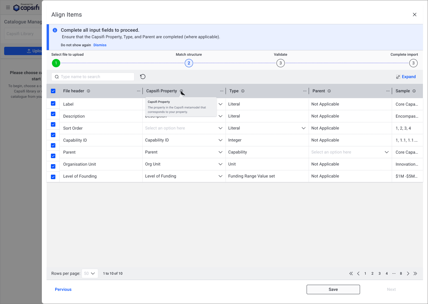
Supporting Decision-Making with Contextual Guidance
Certain fields required domain-specific understanding that was not immediately obvious to new users. Without guidance, users hesitated or made incorrect selections.
Tooltips were introduced to provide lightweight, contextual explanations without disrupting the workflow. This allowed users to understand field definitions at the point of need, rather than relying on external documentation.
By embedding guidance directly within the interface, the experience became more self-sufficient and reduced dependency on support or training.
Transforming AI from Button Action to Guided Assistant
The original AI interaction was presented as a standalone action, offering limited guidance on how it could support users.
The redesigned approach reframed the AI feature as a lightweight conversational assistant, capable of providing suggestions and contextual prompts based on selected business capabilities.
This shift from static action to guided interaction improved discoverability, clarified expectations, and positioned AI as a supportive tool rather than an isolated function.
By integrating AI into the workflow more thoughtfully, the experience balances automation with user control and trust.
Outcome & Impact
The redesign shifted the upload experience from a high-friction, failure-prone workflow to a guided and predictable process.
By introducing clearer action hierarchy, contextual validation, structured progress states, and more thoughtful AI integration, the experience became easier to understand and complete on first attempt.
Impact:
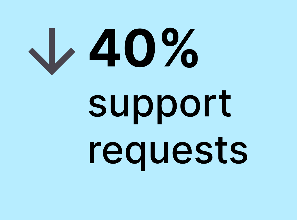
↓ 40% reduction in support requests related to upload errors
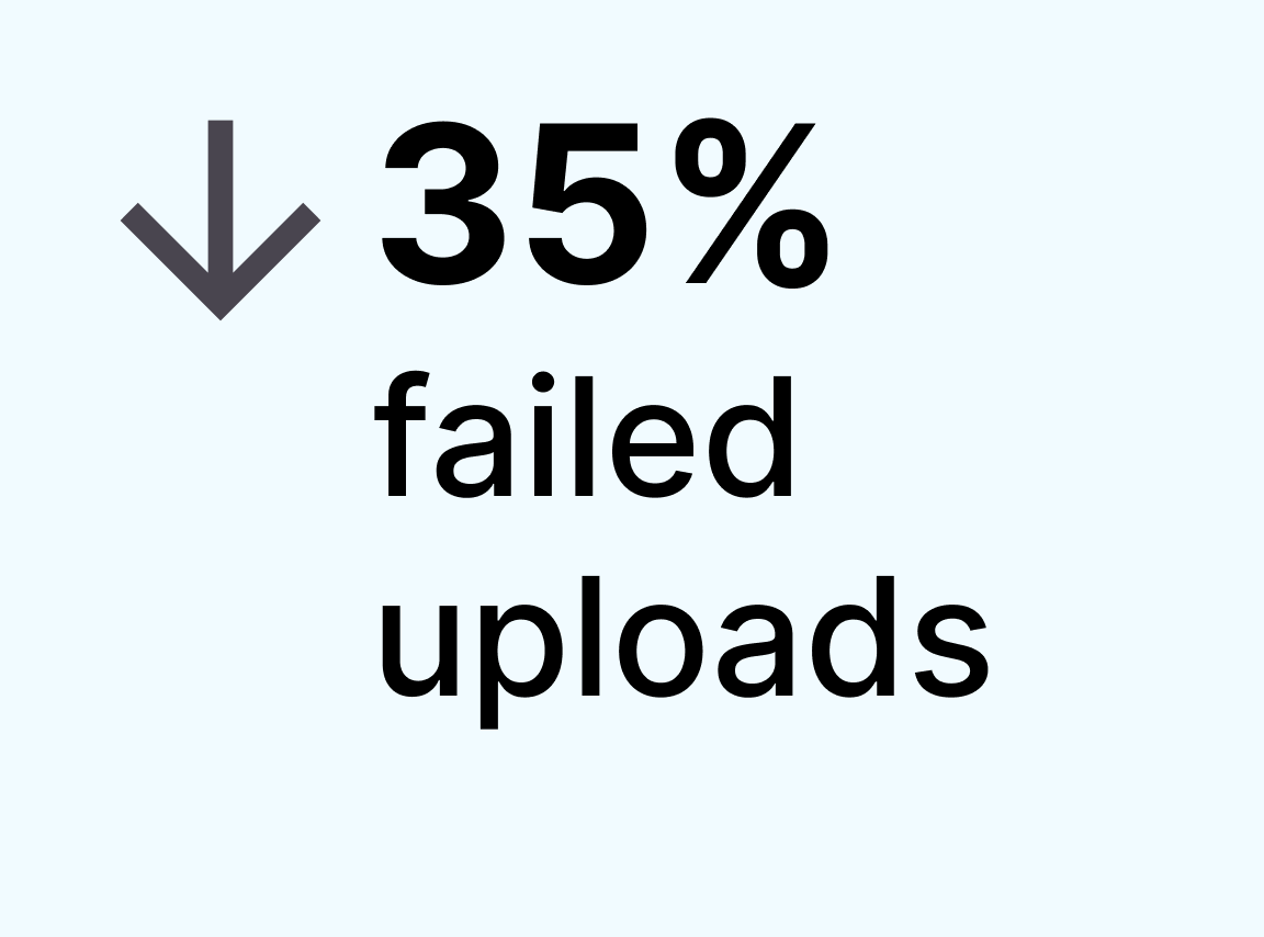
↓ 35% decrease in failed upload attempts
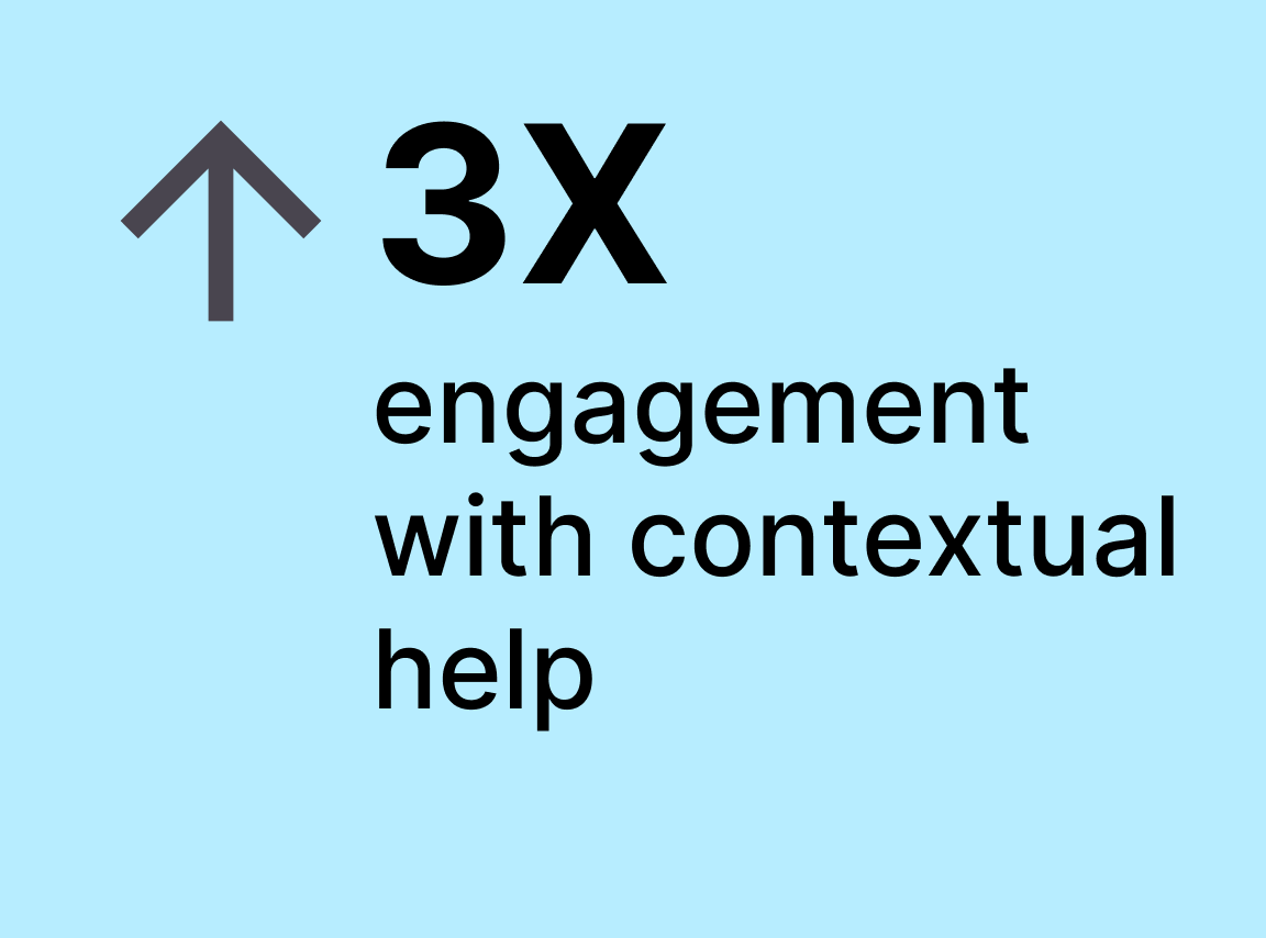
↑ 3× increase in engagement with contextual help content
Beyond metrics, the improvements strengthened user confidence in AI-assisted workflows and reduced operational overhead for internal teams. The upload process moved from being a barrier to becoming a reliable entry point into the platform.
Reflection
1. Most friction is a clarity problem, not a feature problem.
Users were not failing because the system lacked capability — they were failing because feedback and hierarchy were unclear.
2. AI requires stronger UX, not weaker UX.
AI features increase uncertainty if system state and expectations are not transparent. Context-aware availability and clear processing feedback are essential for trust.
3. Micro-interactions drive macro outcomes.
Seemingly small changes — inline validation, error highlighting, tooltip guidance — significantly reduced cognitive load and prevented repeat failures.
4. Prevention is more powerful than correction.
Shifting from reactive error messages to preventative guidance reduced support demand and improved completion rates.
This experience strengthened my belief that thoughtful system design — especially in complex SaaS platforms — directly impacts adoption, retention, and operational efficiency.
Next Case Study

SCATS Traffic System
I redesigned SCATS’ internal traffic management tool to simplify a legacy interface, improve operator workflows, and reduce training time for government users.