
Building a Scalable Design System for Enterprise SaaS
Improving delivery speed, reducing rework, and creating scalable product foundations
Context
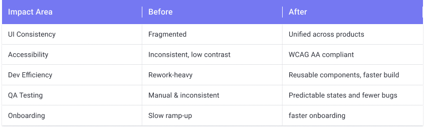
Capsifi operated without a formal design system. UI patterns were inconsistent, workflows varied across modules, and developers frequently required clarification during implementation. As a small cross-functional team, these inefficiencies directly impacted delivery speed and QA cycles.
I led the creation of a scalable design system to improve consistency, reduce ambiguity, and increase delivery predictability.
Problem
Inconsistent UI patterns across modules
High clarification cycles between design and engineering
Significant developer rework due to interpretation gaps
QA cycles extended due to unclear interaction behaviours
No reusable component structure — each screen was treated as bespoke
Without system foundations, workflow efficiency and product scalability were limited.
Business Impact
The introduction of a structured design system produced measurable operational improvements:
Developer rework decreased dramatically due to clearer interaction definitions
Clarification questions between design and engineering reduced significantly
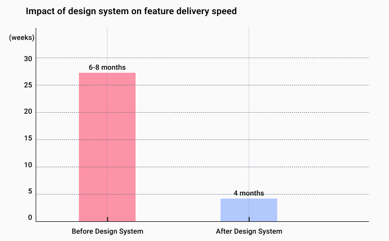
Design production time was cut by approximately 80%
QA cycles shortened as interaction behaviours became predictable and documented
Workflow efficiency improved by 20% or more across affected modules
Product consistency improved substantially compared to the pre-system state
For a small team, these efficiency gains had a direct impact on delivery speed and predictability.

Additional impact:
Reduction in UI-related bugs by 40%
A decrease in development time for new features by 80%
Improvement in user satisfaction scores by 95%
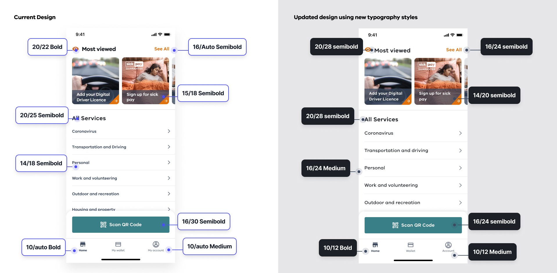
Before
1.5 Home page
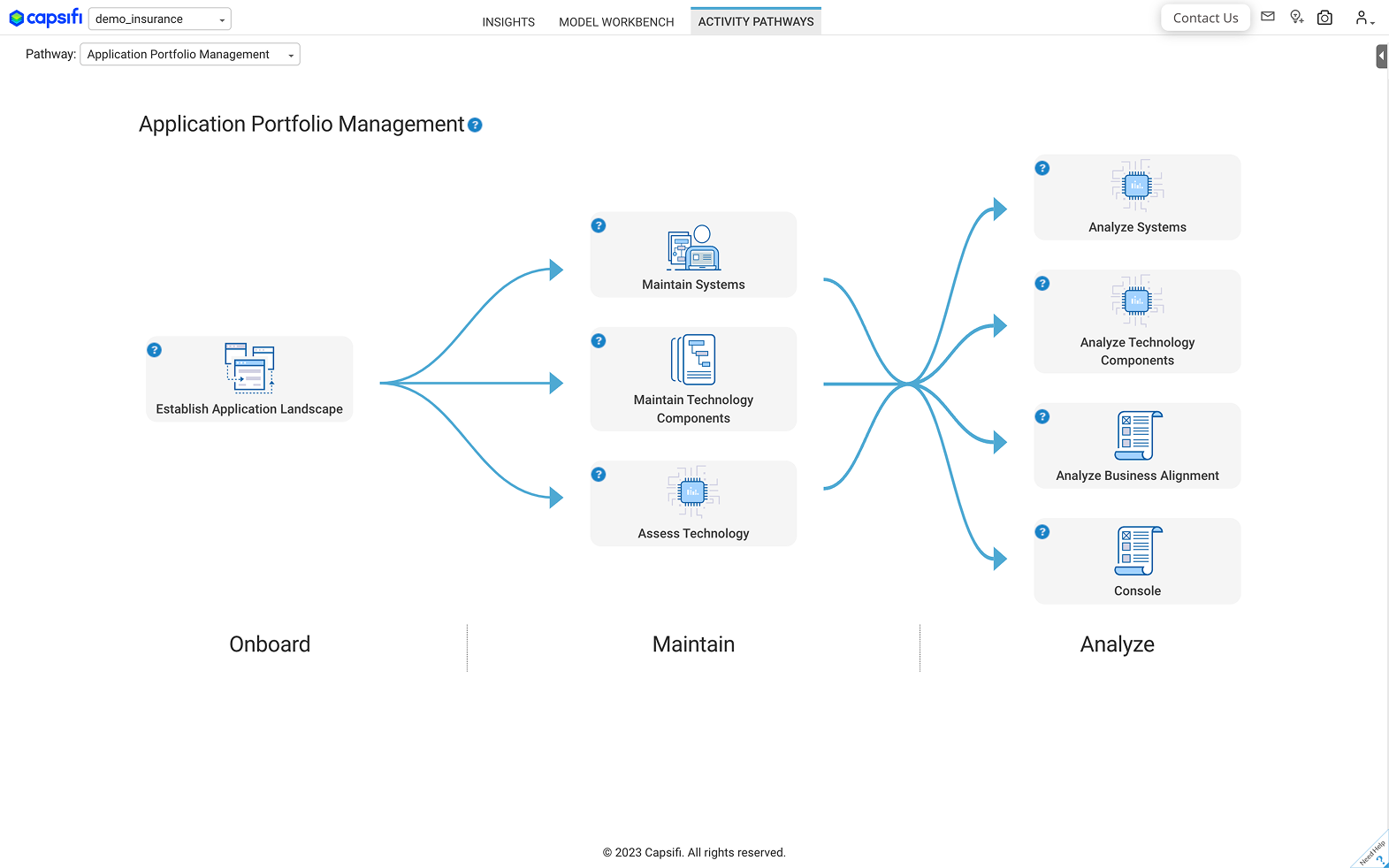
1.5 Application Portfolio Management
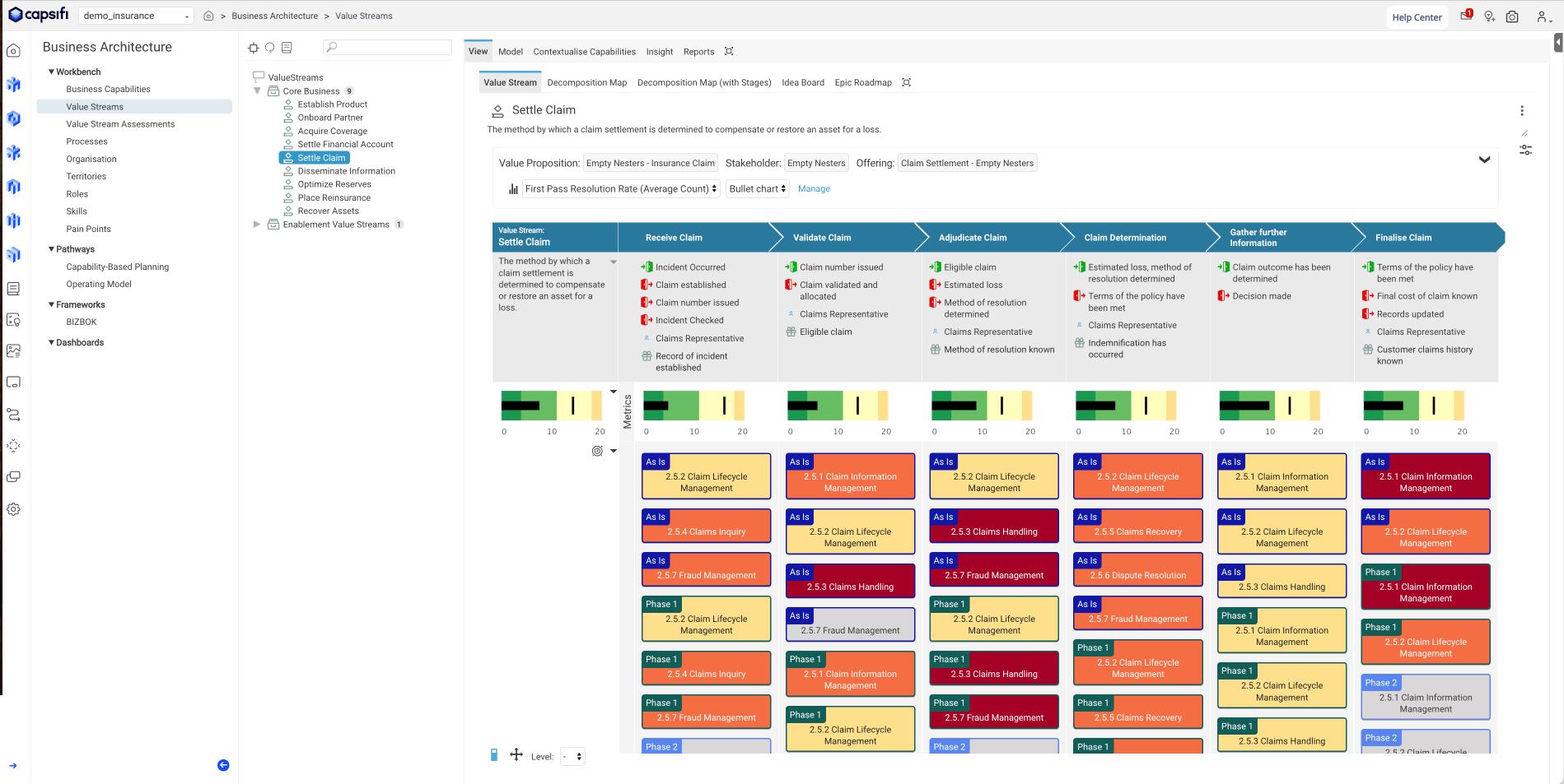
1.5 Value Stream
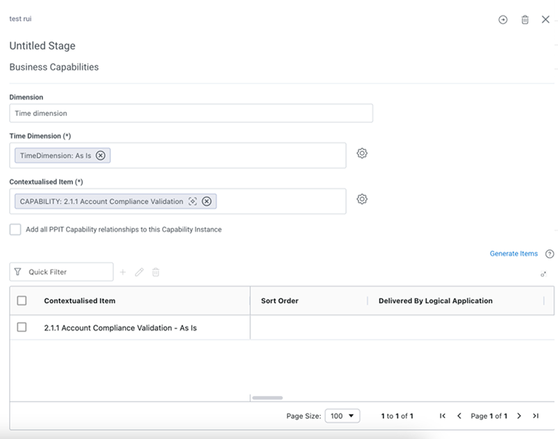
2.0 Flyout Form
After
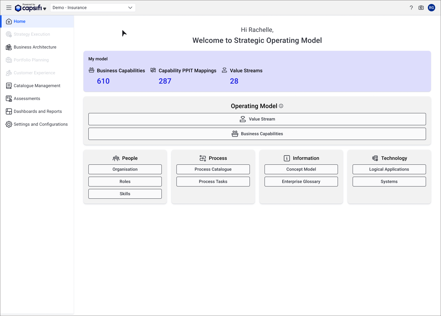
2.5 Home Page
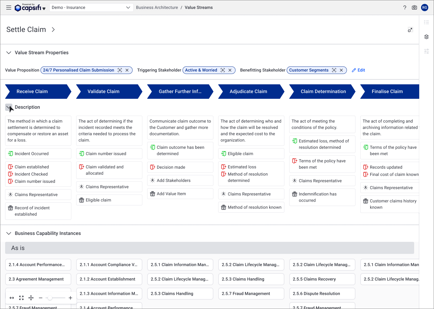
2.5 Value Stream
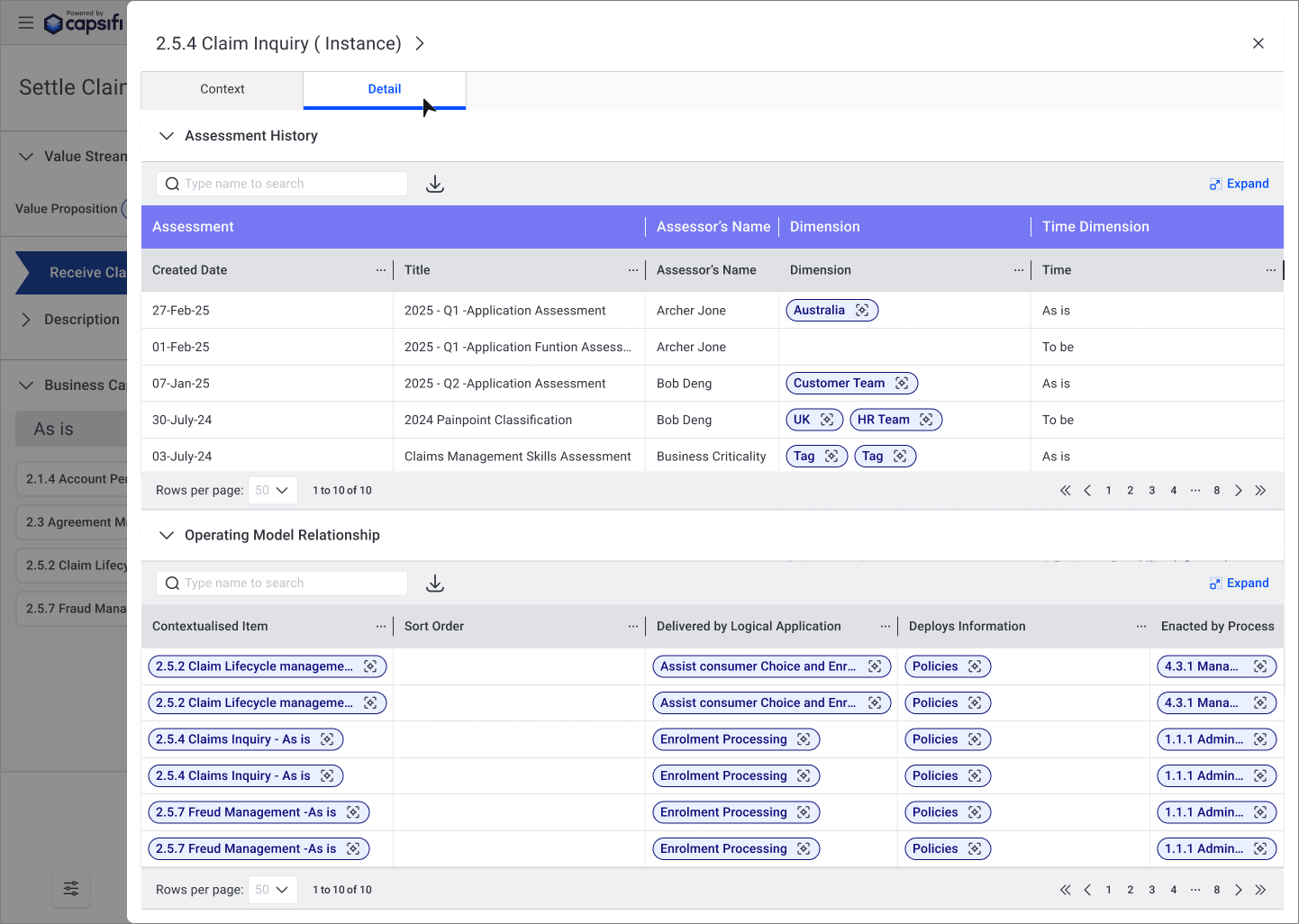
2.5 Fly-out Read Only Table
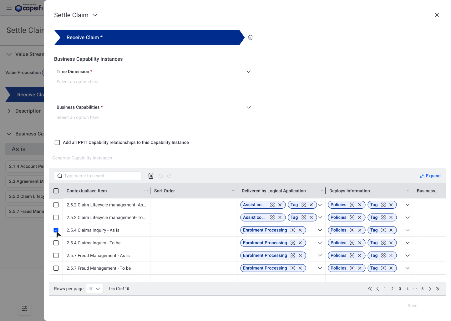
2.5 Fly-out Form
My Role
As the sole UX/UI designer, I:
Conducted a full UI audit
Defined token structure and naming conventions
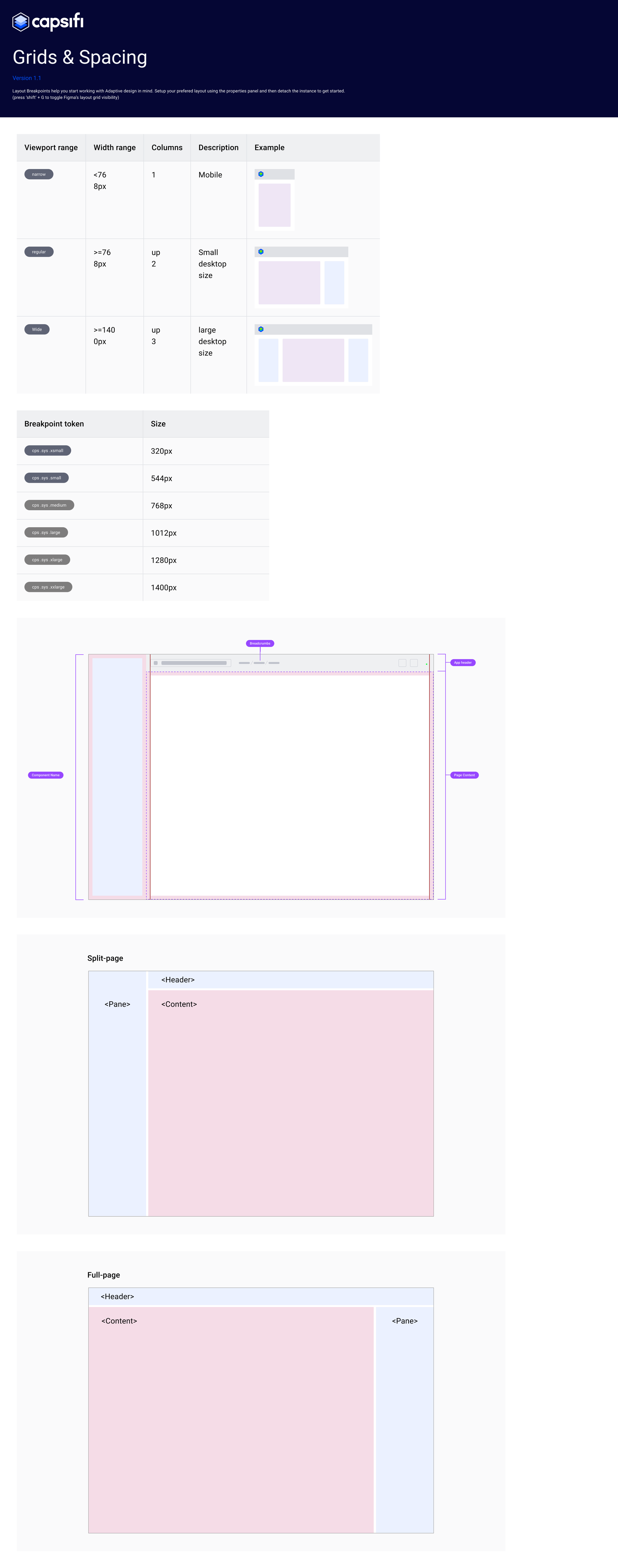
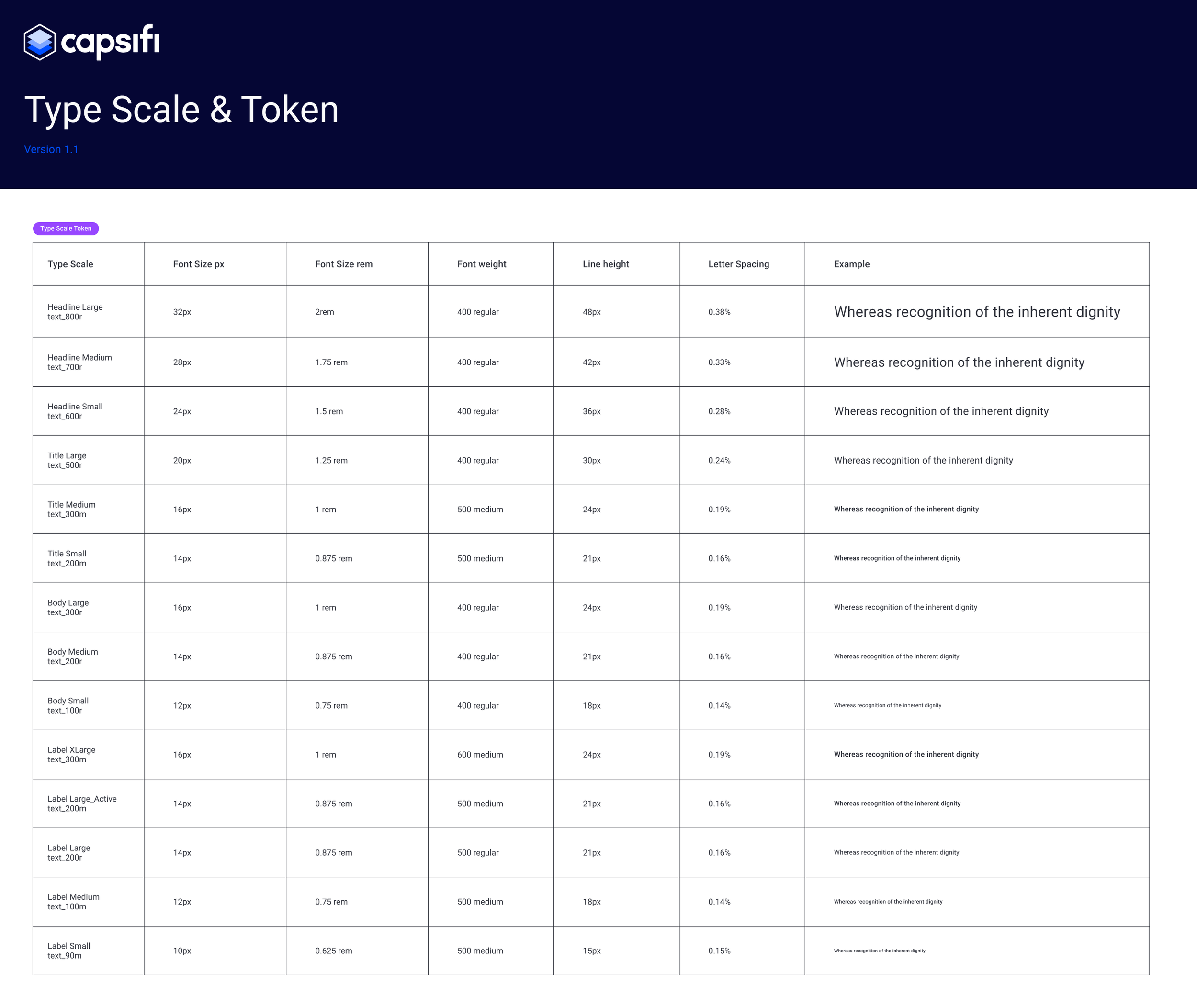
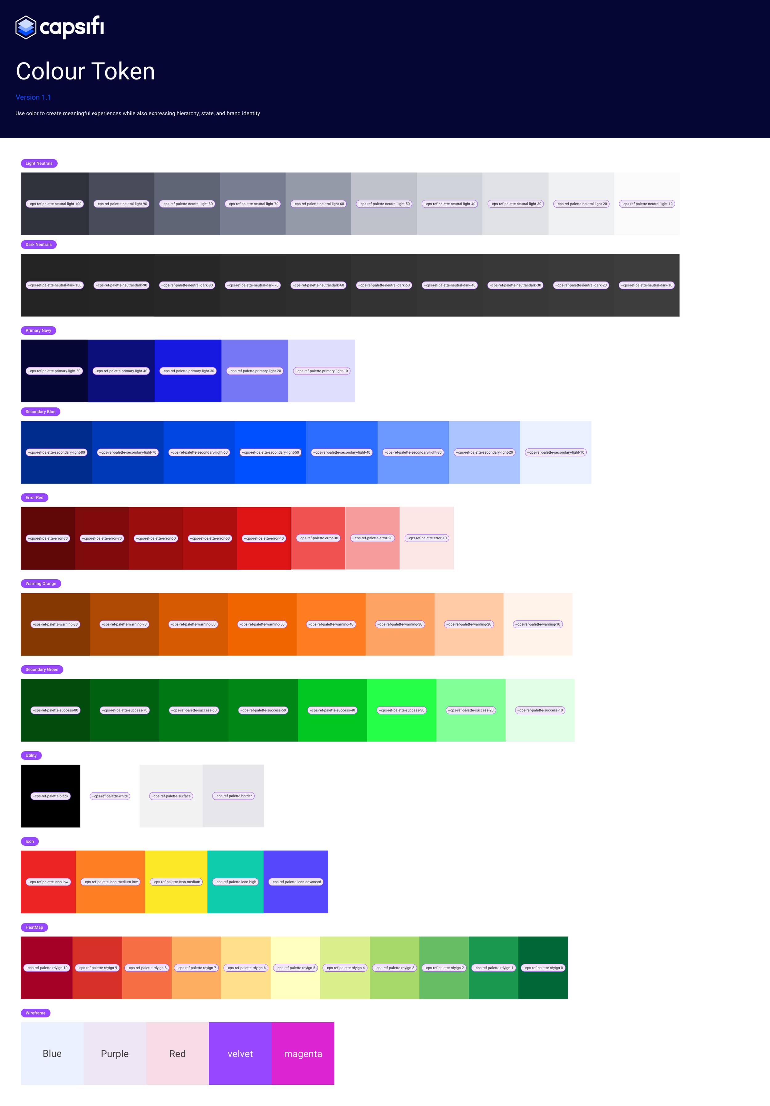
Built a foundational design system in Figma
Partnered with developers for token implementation
Documented usage rules and interaction states
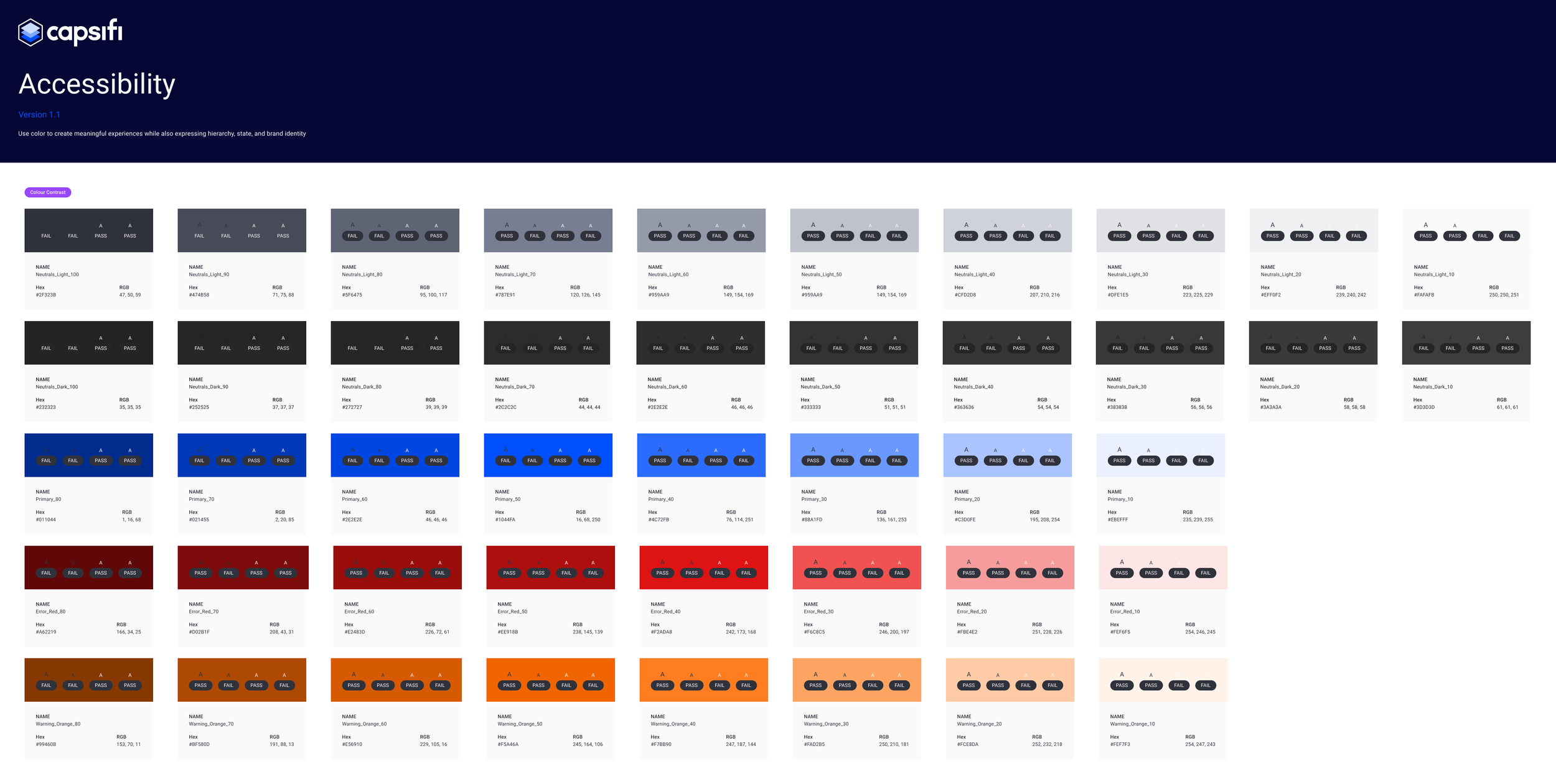
Ensured WCAG 2.1 AA accessibility compliance
Strategy & Approach
1. Prioritised High-Impact Components First
Rather than designing everything at once, I prioritised the most frequently used and highest-friction components across workflows. This allowed us to immediately reduce inconsistencies where they mattered most.
2. Modular System Thinking
I designed the system using modular principles — breaking complex workflows into reusable interaction patterns and atomic components.
Most components were intentionally designed for reuse across multiple operational modules.
3. Engineering-Aligned System Design
I worked closely with the Dev Lead to align the design system with their existing code library.
Instead of creating purely visual CSS patterns, we co-designed components that aligned with backend functionality and avoided technical rework.
This meant:
Design decisions reflected real implementation constraints
Components were mapped to existing code structures
Rework was avoided before development began
4. Accessibility Integration
Applied WCAG AA colour contrast rules
Designed clear focus states for keyboard navigation
Worked with the dev team to align on ARIA roles and keyboard behaviour
5. Beyond Visual Consistency
The system addressed:
Interaction behaviour
Validation states
Edge cases
Functional logic
Accessibility patterns
This ensured QA teams had clarity not just on layout, but on behaviour.
What I Learned
How to drive the adoption of a design system from scratch
The importance of aligning with frontend naming and constraints
Balancing long-term vision with short-term developer feasibility
Creating patterns that scale across complex enterprise workflows
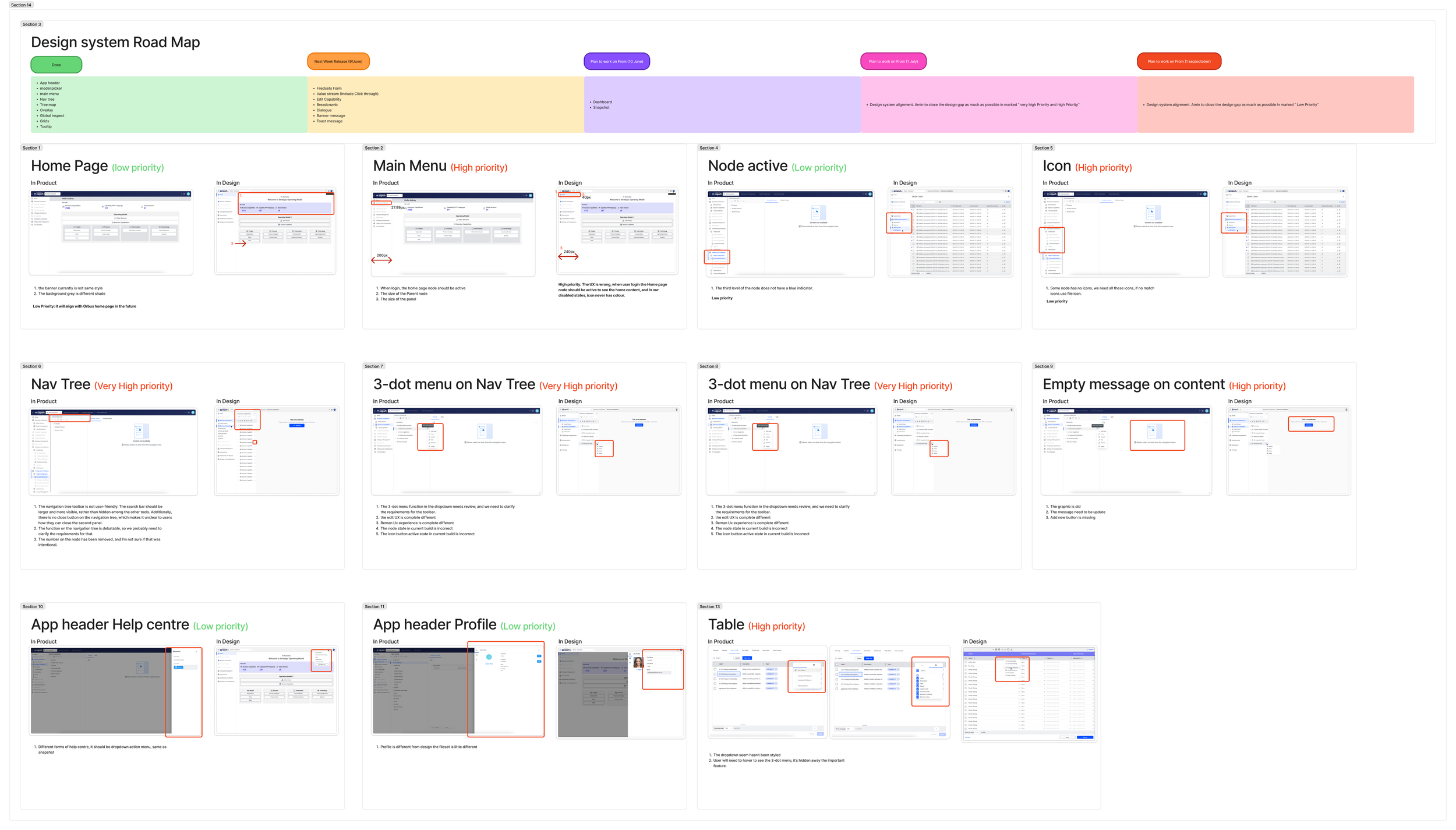
Examples
Next Project
Service Victoria Design System
I uplifted Service Victoria’s existing design system to bring more visual consistency, clarity, and usability across the platform.